What follows is a case study for an application that was created as part of a three term senior project at Drexel University. This project is a culmination of 3 years of studies at Drexel, and puts to use everything that I have learned in that time, including: user experience research & Design, user interface development and more. This this application is the rest of the combined work of myself and the rest of App Design Team, along with a team of developers from Drexel’s College of Computing and Informatics. I speak for all involved when I say this project was a labor of love.
Introduction
Overcoming MS is a non-profit organization that educates, supports and empowers people with multiple sclerosis in evidence-based lifestyle and medication choices that improve health outcomes. They approached Drexel in the Summer of 2018, in hopes that the university would use its talented pool of students to help craft an application to help those that are new to the OMS program. Since that time, we have been hard at work creating an iOS application that makes following their holistic lifestyle program simple and easy. Our app allows users to track each step of the program, access special tools to make it easier to perform these steps, record symptoms, and learn more about both multiple sclerosis and the program. Doing all of this serves to reduce the intensity and frequency of symptom flare-ups in those with MS.
MS is a disease that affects about 2.5 million people, where the immune system attacks the covering of nerve fibers. MS causes a range of symptoms, the major ones being fatigue, thinking problems, vision problems, depression, and pain, but the disease is highly specific and symptoms can vary wildly between individuals.
Based on their findings, the OMS organization has developed a program that has been shown to reduce the severity of symptoms. This daily program includes following a plant and fish based diet, getting sunlight or taking a Vitamin D supplement, thirty minutes of exercise, meditation or other stress-reduction techniques, taking your prescribed medication, and general knowledge and prevention.
Following all of these steps while trying to lead a better life can be overwhelming for someone who is new to the program. While OMS does a great job of laying out the steps of the program and ways to complete them, a daily tool to make it easier for people with MS to manage this complexity was sorely needed, and that is where our app comes in.
Journey
Designing this application was a huge learning experience for all of us. We followed a user-centered design methodology, meaning that the needs and wants of people following the OMS program drove every step of our process. That process included constant research and testing as we went through multiple phases of design, reaching out directly to the OMS community for feedback and support.
Research
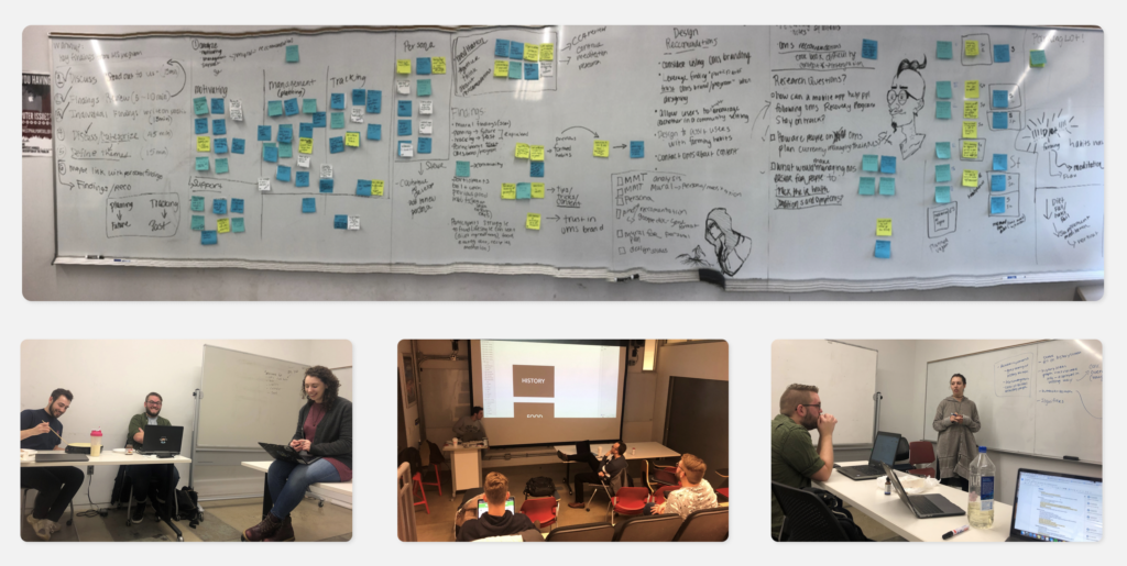
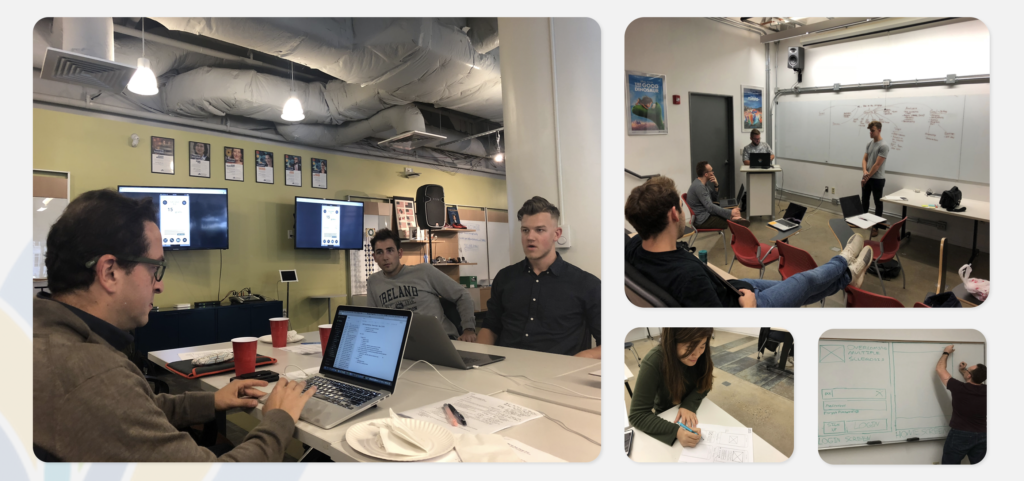
Before we jumped into designing the app, we focused heavily on researching our target audience. This involved speaking directly to people from all over the world on the OMS program, from people just starting to those who have been on it for years. In these interviews, we were able to learn what was difficult about following the program and how they manage those problems currently. We then took these findings and created reports for our designers to start the design process. And as that process started, we quickly took early versions of their screens and tested it with our research participants, giving us a great sense of what was working and what wasn’t.
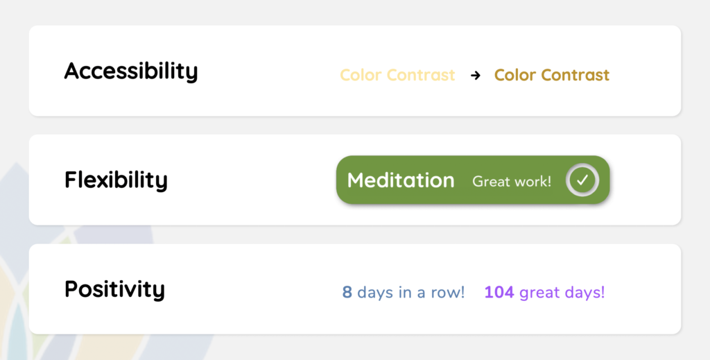
There were many important insights that we learned from our research process. One insight was that MS can cause vision and muscular issues that might make certain actions and gestures difficult, so accessibility became an incredibly important principle to design the application around. We also found that an experienced user might want to pop in-and-out of the app quickly to complete something, but someone new to the program might need a more in-depth experience, so the app needs to be flexible and support both. Finally, users wanted an encouraging and positive app, not being punished if they can’t perform certain tasks because of symptom flare-ups.
Design
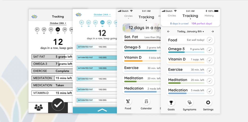
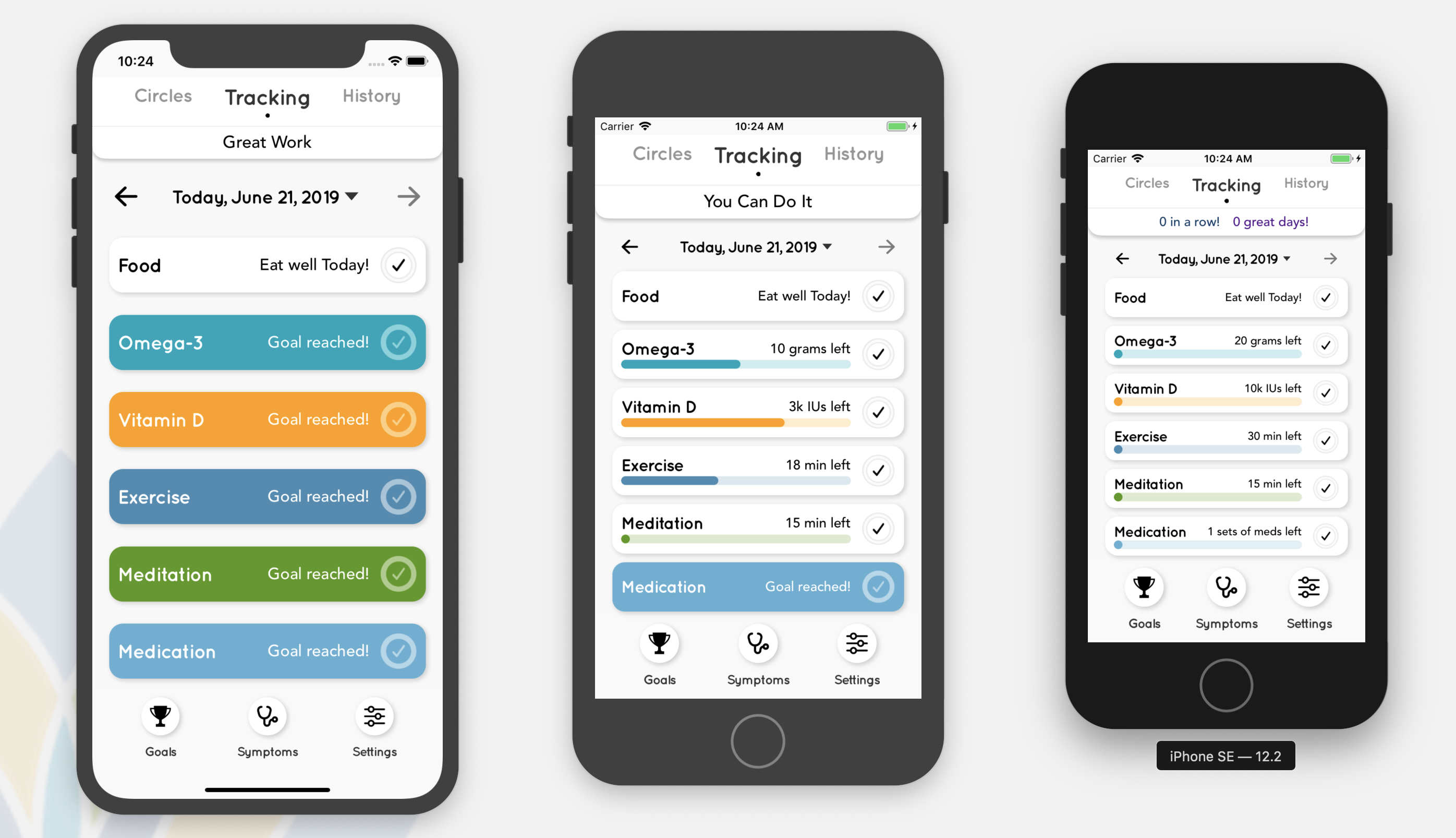
Like any creative process, our designs went through many evolutions over the year. One of our main goals from the start was to make sure each screen only had the most important information needed for what they are trying to accomplish. We quickly decided that the first thing the user would see when they opened the app is the progress bars for each step of the program. Moving forward, we fleshed out our overlay system, which contains more specific actions that will help the user in their journey. On the visual end, we slowly moved from a unicolor design towards a multicolor palette where each color gives a unique feel to the specific step it’s assigned to.
As a rundown of how the app works, users can press directly on the progress bar to find individualized tools to help them meet their goals. For example, a user could complete their exercise goal by entering in the type and amount of exercise that they did that day.
But if a user is experienced with the program and already has their own ingrained systems and habits for performing some these tasks, then they can also press the checkmark on right of the progress bar to quickly complete that step for the day.
From the home page, users can also adjust their goals and record symptoms they may be experiencing. Here you can see the process of changing a goal for Meditation so that they have to meditate more each day, and adding a symptom you experienced, which can be accessed at any time.
Our designs went through some major renovations as we received feedback from testing. An example of this was how the Diet section of our app worked. We originally asked the user to track how much Saturated Fat they were intaking, because that is a major diet restriction people following the OMS plan must pay attention to. However, we found through testing that this just added an extra layer of complexity that didn’t exist before and confused the users. In the Winter quarter, the Food section was updated to be a more holistic educational tool, where users could search or scan the barcodes of food they may be eating to see if it fits the OMS diet.
Development
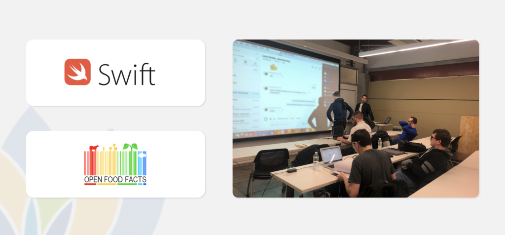
While the design process was occurring, developers from Drexel’s College of Computing & Informatics were hard at work laying the groundwork for the final application. The app was built using Apple’s Swift programming language and utilizes the OpenFoodFacts database as one of it’s core features, which allows users to check if foods fit the OMS diet. While many teams with our setup treat development like the next step of an assembly line, we made the process more collaborative by sitting down right next to our developers as they were coding the interface. This allowed for design questions and concerns to be addressed in real time, and insured a seamless transition from vision to implementation.
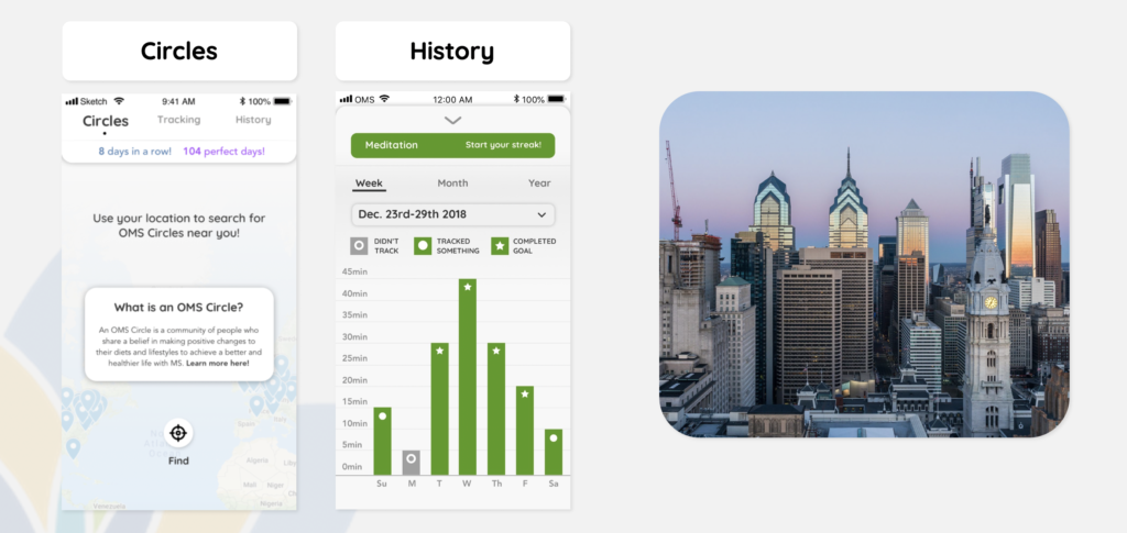
Our team also took the liberty of designing two other parts of the application for future versions of the app. One of which was Circles, named after the local meetups organized by OMS, where users can see if any exist in their area and find contact info. The other is History, where users can see a more analytical view of their progress on the program. Going forward, the app will be handed off to a local agency who will take over the development of the app for the final touches and future maintenance before being released on the App Store later this year.