This case study is the capstone project for my master’s coursework at the Maryland Institute College of Art. With only eight weeks to complete, I decided to take full advantage of my passion for fitness and conduct some research that would help inform the creation of a mobile application prototype.

As a former servicemember, I always look for ways to support my fitness goals. This case study reflects my effort to fulfill that passion with a focus on mobile solutions.
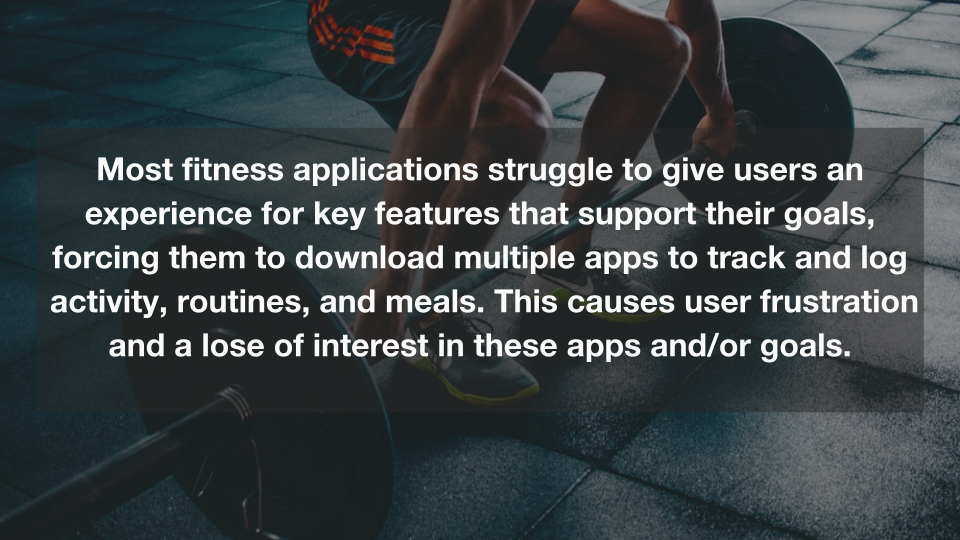
In the beginning of my research, I noticed a trend: a lot of useful features are either not present, or hidden behind a subscription service. So the plan was to explore whether there was desire for users to have a simple and free (or a least less costly) application; one that allowed users to document their workouts and create a plan based on their unique goals. But very early on in the process I had my assumptions challenged. This case study aims to take you through my journey, from defining the problem, to the prototype that was born out of my research.
Problem Statement
Solution
Target Audience

- People of all ages, genders and demographics.
- Those that workout three or more times a week.
- Those that use or would use mobile applications for tracking health & fitness goals.
- Fitness Enthusiasts & Fitness Professionals
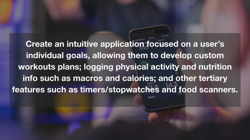
The target audience for this solution are those that will benefit from an intuitive app that allows them to take charge of their goals, by providing them the ability to view/add a library of exercises that they can user to create workouts designed for them. In seeking out these user types, I was able able to more quickly hone in on those that met the above criteria.

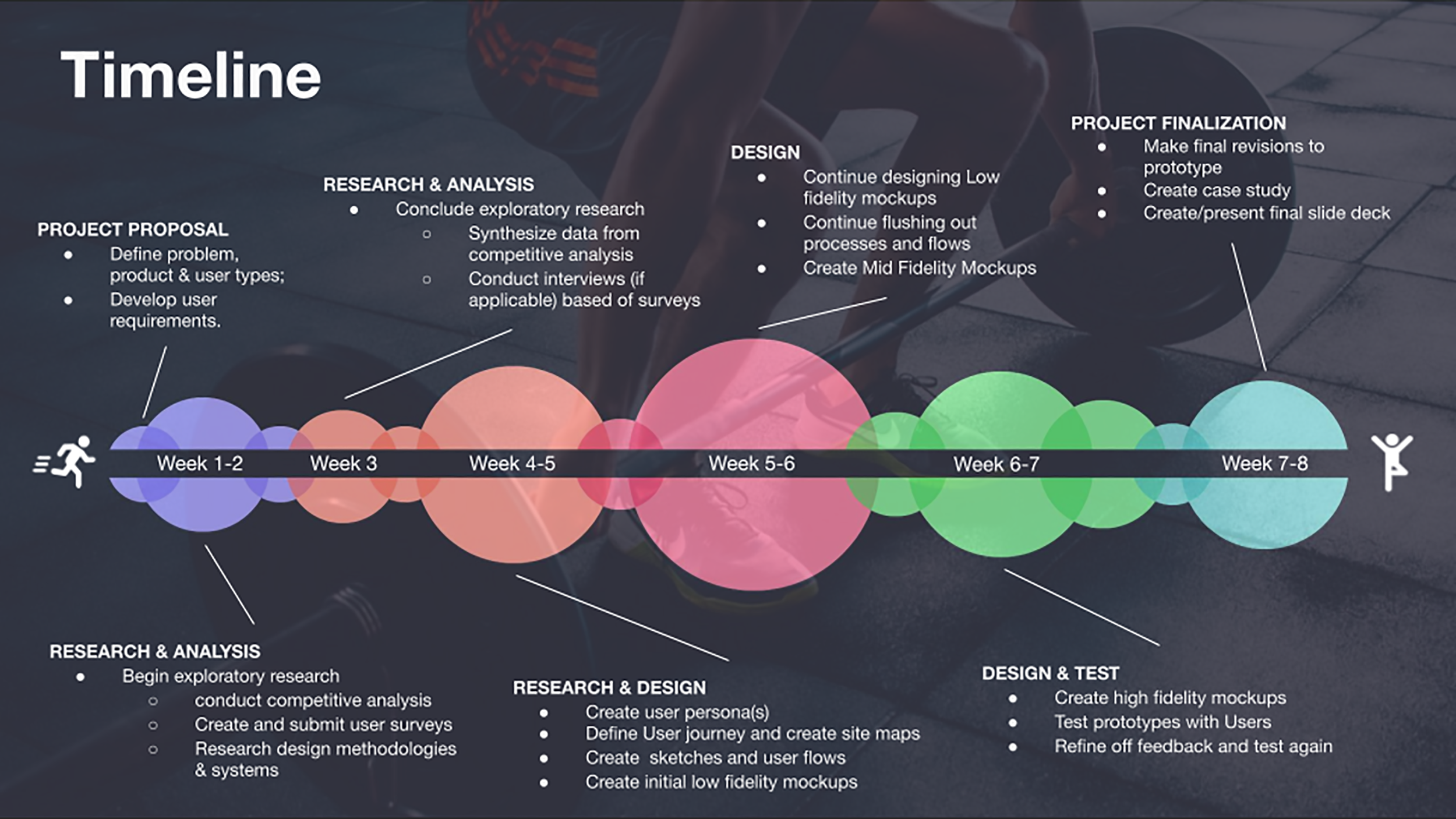
For this project I implemented an Agile style methodology. This enabled me to react quickly to changes based off research and user feedback. The project consisted of seven one-week sprints, with each having an important milestone that needed to be hit.
Soliciting Users
I began by identifying users through an online survey. I kept the surveys short so as not to deter anyone who may be put off by lengthy questionnaires. The survey included the following questions:
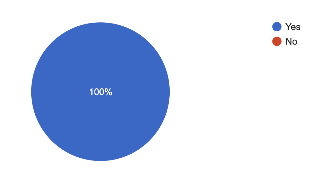
Do you exercise more than three days a week?
(32 responses)
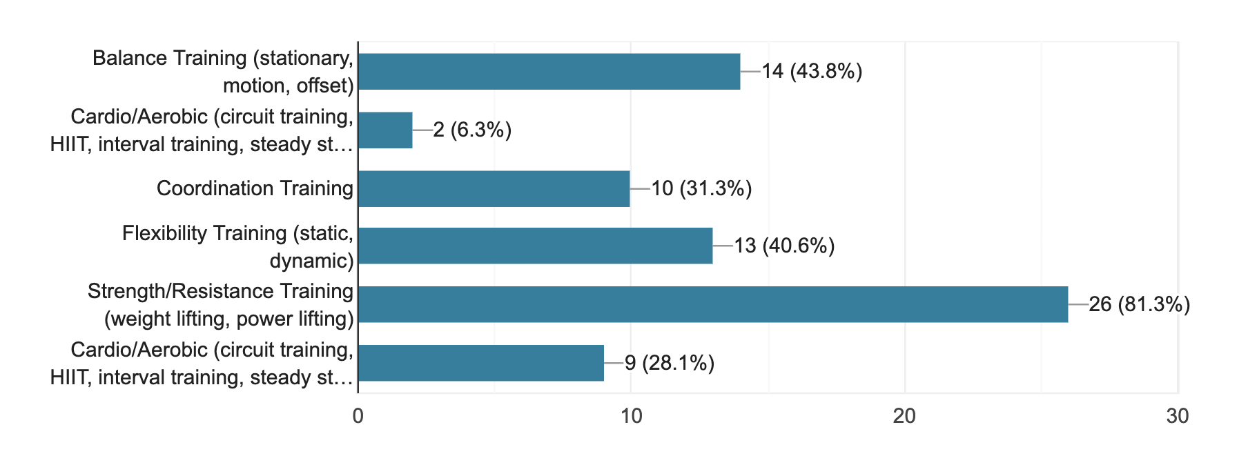
Types of exercises you regularly do – select all that apply:
(32 responses)
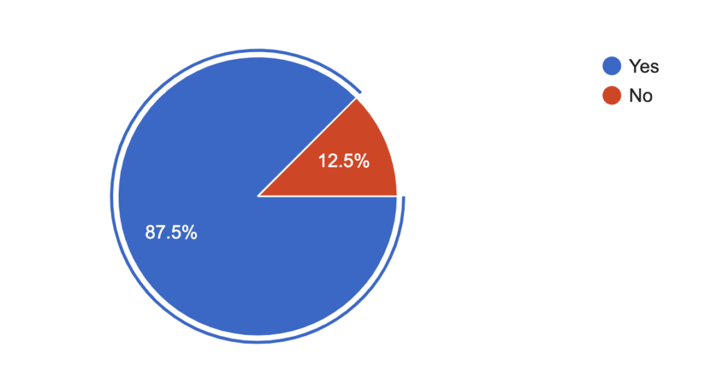
Do you use fitness applications for tracking progress?
(32 responses)
What are some applications you use or have used in the past?
| 10k Runner | Fitbit | Fitness Buddy | Heavy Metal |
| Woodify | Workout Trainer | Hatch Squat | Strong Lifts |
| BodBot | Body Fitness | Exercise Made Easy | Be Fit |
| myFitnessPal | Google Fit | Bodbot | Endomondo |
| Strava | Trainerize | Tabata Pro | MapMyRun |
| Nike Training | Less Mills | MyMacros+ | FitBod |
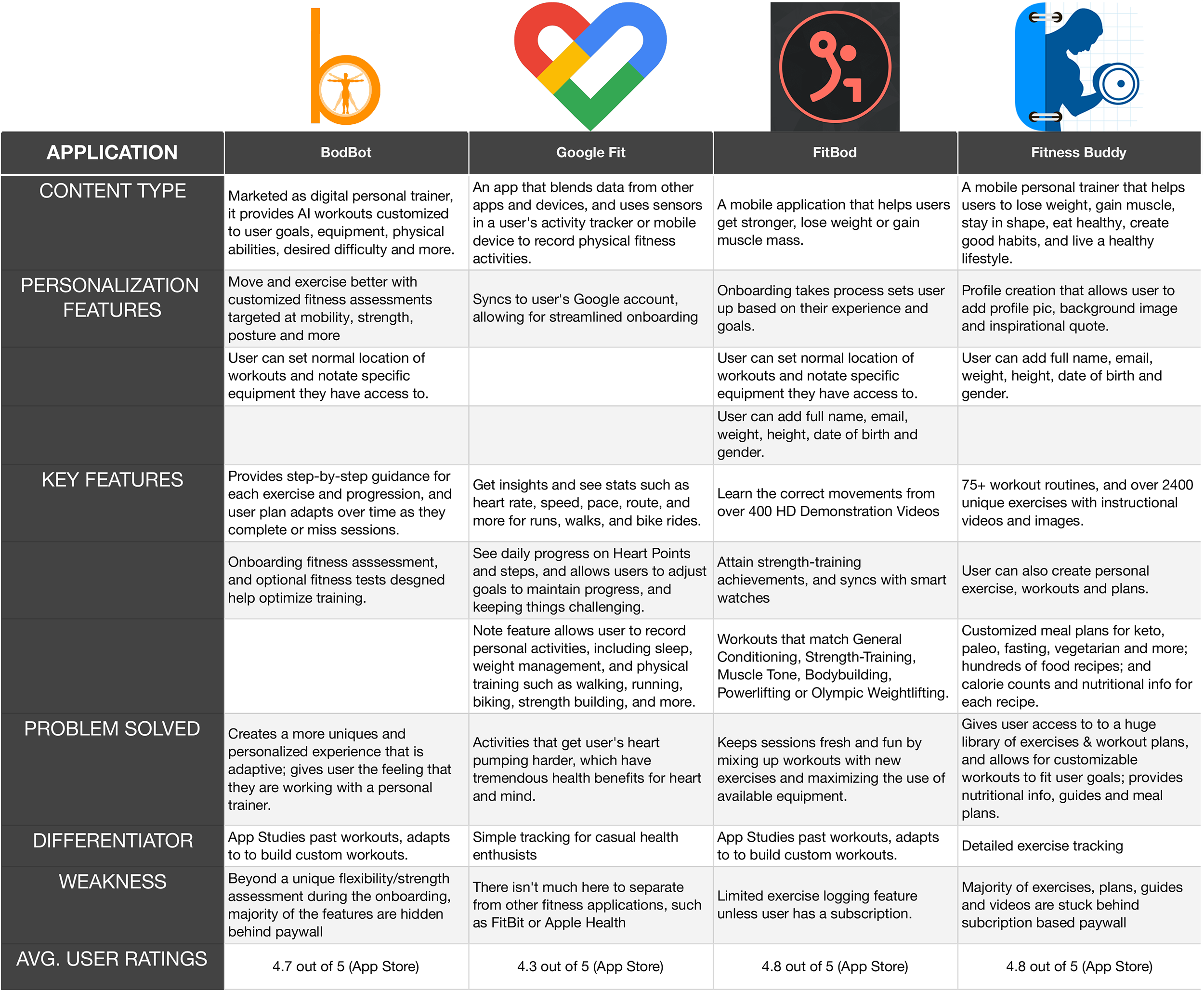
Competitive Analysis
The data from the surveys helped me identify four primary applications for analysis. Because, at the time I was still focused on the issue of subscriptions and paywalls, I noted that all of these apps aside from Google Fit had a paywall locking away some really great features or expanded content. For example, Fitness Buddy has a huge collection of exercises, but a good portion of those exercises were locked out, allowing the user to see them on the list, but unable to access the associated content. One through-line I noticed on all of these apps was the inability for the user to create customized workout routines.
User Interviews
5 Participants
4 Females | 1 Male
Age Range 25-39
I brought some insights from the competitive analysis with me when I conducted user interviews. Participants were those I followed up with from the surveys I sent out.
Key Insights
- Users wants more control for inputing app data; personalized experience; want to see measurable progress.
- Users would pay for subscription or one-time fee rather than see ads or be interrupted by ads before/during workout.
- Having a plan of action for workout session is helpful.
- To be able to visualize data, or progress into some kind of dashboard, ala bars, graphs, number highlights.
- There may be a use case to use this app for personal trainers who would want to create workouts manually and assign to a client.
- The idea app integration with playlists from music apps that will work seamlessly with in-app timers.
- New users, or those without a deep knowledge of a fitness regiment may want to see the app recommend workouts.
- Users definitely like the idea of having features integrated more seamlessly into app, i.e. workouts, nutrition and timers
I mentioned previously my assumption that people would want a subscription-free alternative. as you can see from the insights above, that was not the case. Three out of the five users stated that they didn’t mind subscriptions or one time fees, as long as they were getting the features that were important to them.
“I wish there were just more seamlessness with apps, and less clicking around … You know how sometimes if you’re filling in forms on certain sites or other non related apps, and as you fill out each section, it will skip you down to the next box? I want something like that. Or if I hit enter, it’ll go to the next box, so I don’t feel like I have to constantly click or tap into each specific spot.“
– C. Field, talking about her frustration with apps like Trainerize
“I find it annoying when I’ve missed part of a workout [or logging part of a workout], and I’m unable to fit it in some of my other workouts, and I can’t jump between workouts without without ending them. So you can’t pause a workout to look at another to look at stats or see missed movements. And if I have to stop midway through a workout for whatever reason, but want to go back later and finish it, I don’t get the updated stats that I’ve added to that workout.
– A. Height, talking about her frustration with updating or resuming previous workouts
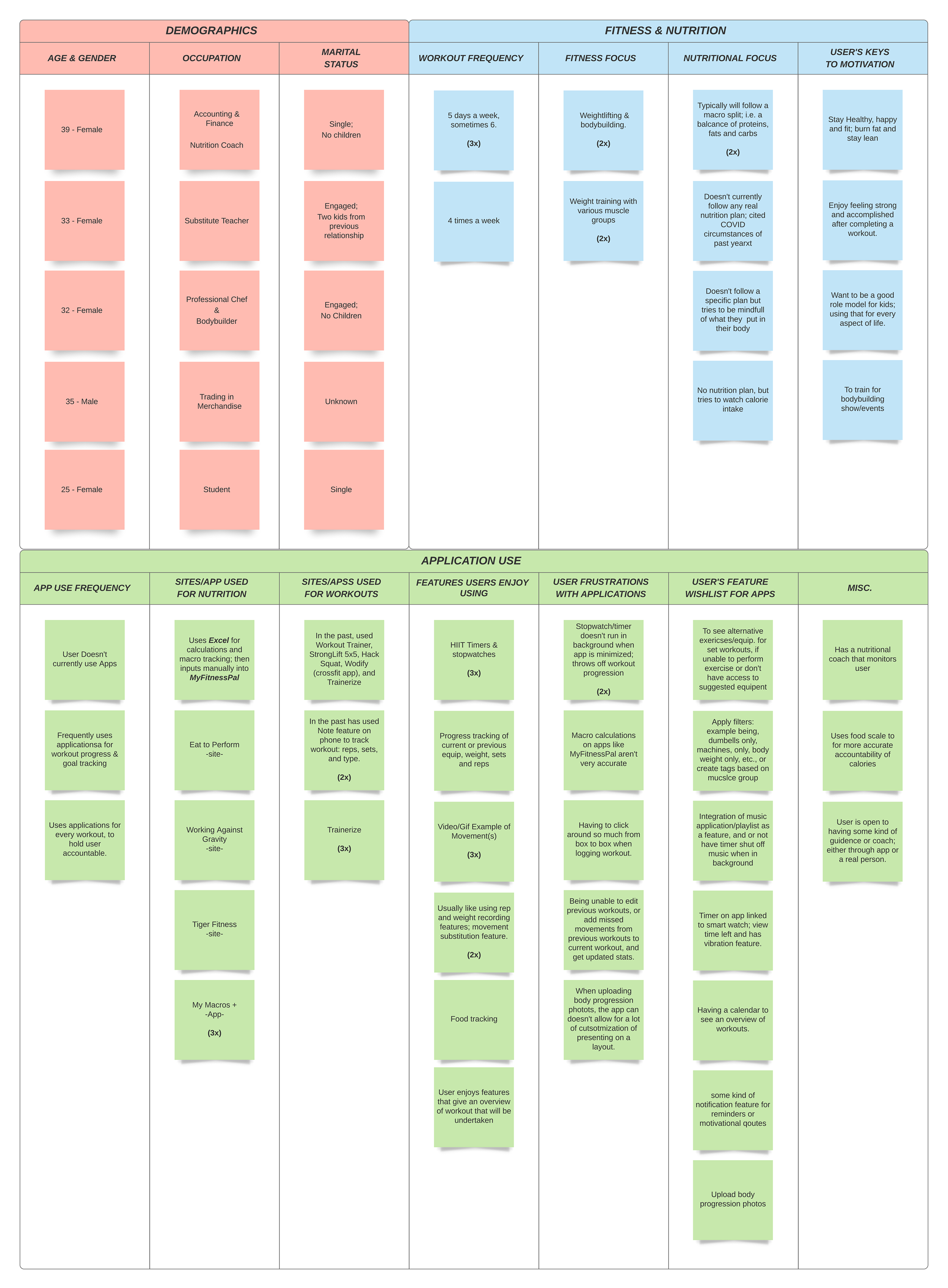
Affinity Mapping
During the interview phase, I put together an affinity map using Lucidchart. I used Otter.ai to transcribe the interviews. I scrubbed through all texts and pulled out anything of note and dropped it on the map. As I completed more interviews, I was able to start categorizing like items and use them bring more into focus who my users were and what they needed.
User Persona
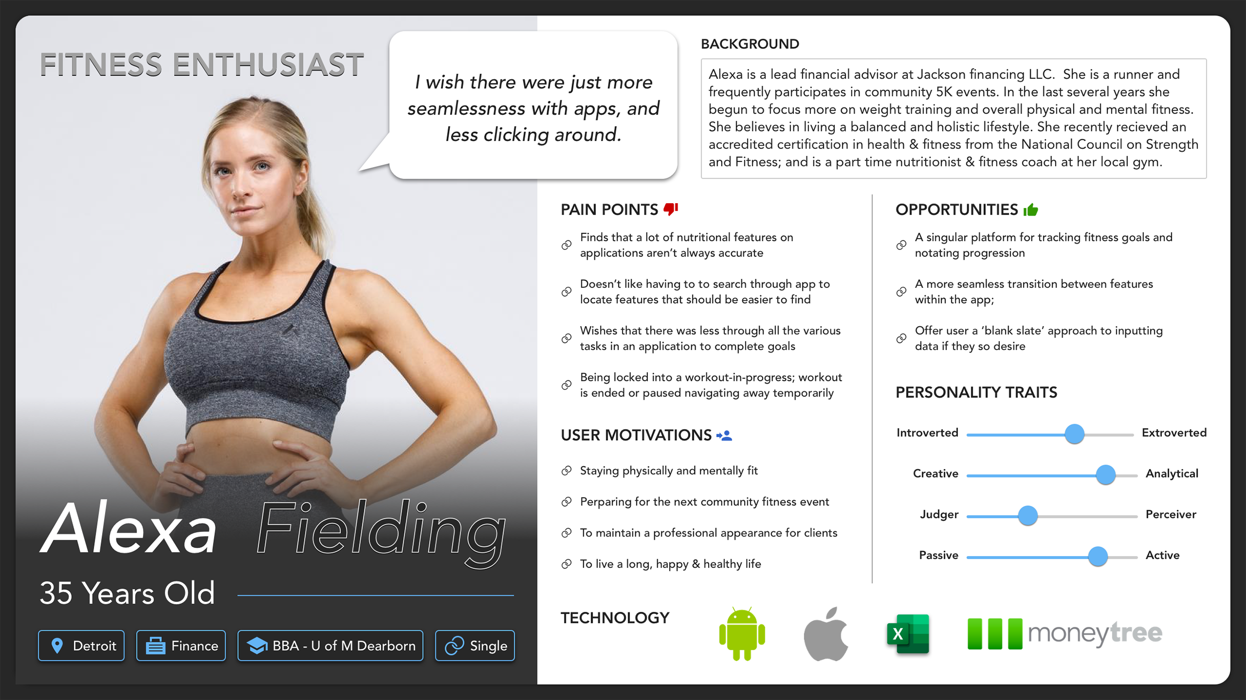
After my initial research, and the subsequent interviews, my user type was more clearly defined. From that, I created this user persona. Many of those I interviewed demonstrated an astute business and nutritional acumen so it made sense to have that reflected here. All of them were motivated to staying mentally and physically fit. and each one found frustrations in the limitations of current applications.

While interviews were ongoing, I started in on the initial stages of design. I began with some site mapping, and then generated some user stories for features the application might contain. From there, I created some low fidelity wireframes to help me start generating ideas for how the app would look and hows users would interact with it. My efforts in design ended with some mid-fidelity mockups and a prototype of a specific feature of the application.
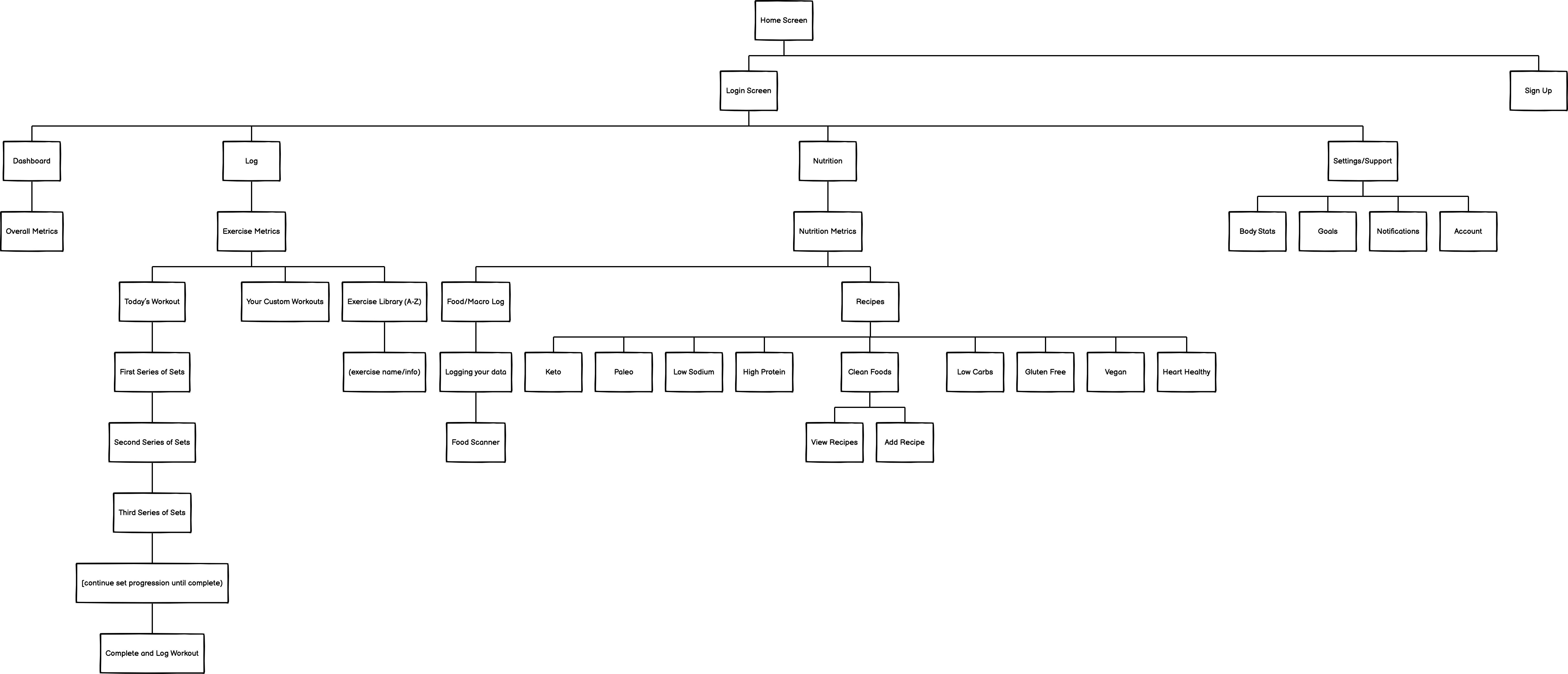
Site Map
The site map consists of four main navigation points.: the Dashboard, Workouts, Nutrition, and Settings. I was more granular with Workouts and Nutrition flows, because I knew both would be a large undertaking in the design process. Scoping out the app in this way helped me to decide to further focus my efforts for time being on showing the user how to create customized workout routines.
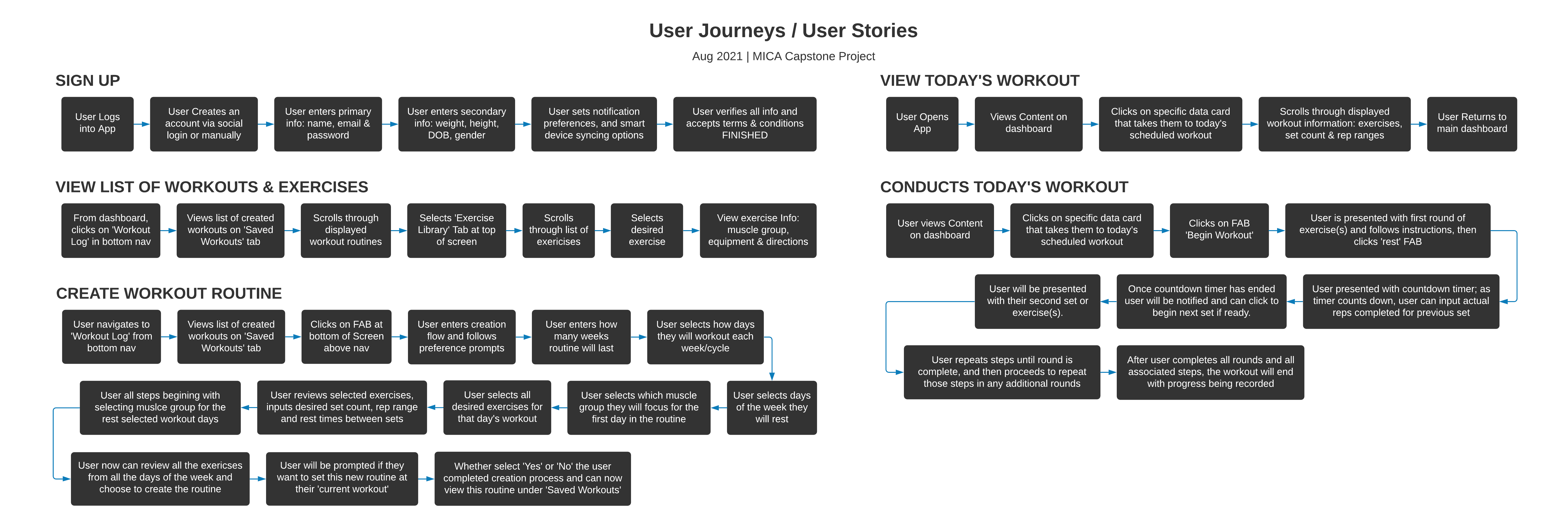
User Stories
Once I made the decision to focus solely on the workout feature of the application, I created a series of user stories that would address a journey through various scenarios within this feature. They included: viewing your list of workouts or individual exercises, viewing a specific workout plan, creating a workout routine, and conducting a featured workout.
Wireframes
Creating a few user stories gave me the basis to move forward with some digital concepts; I used Balsamiq to generate some low fidelity wireframes, which facilitated discussion with my cohorts and help me visualize the ideas that were were starting to come in focus.
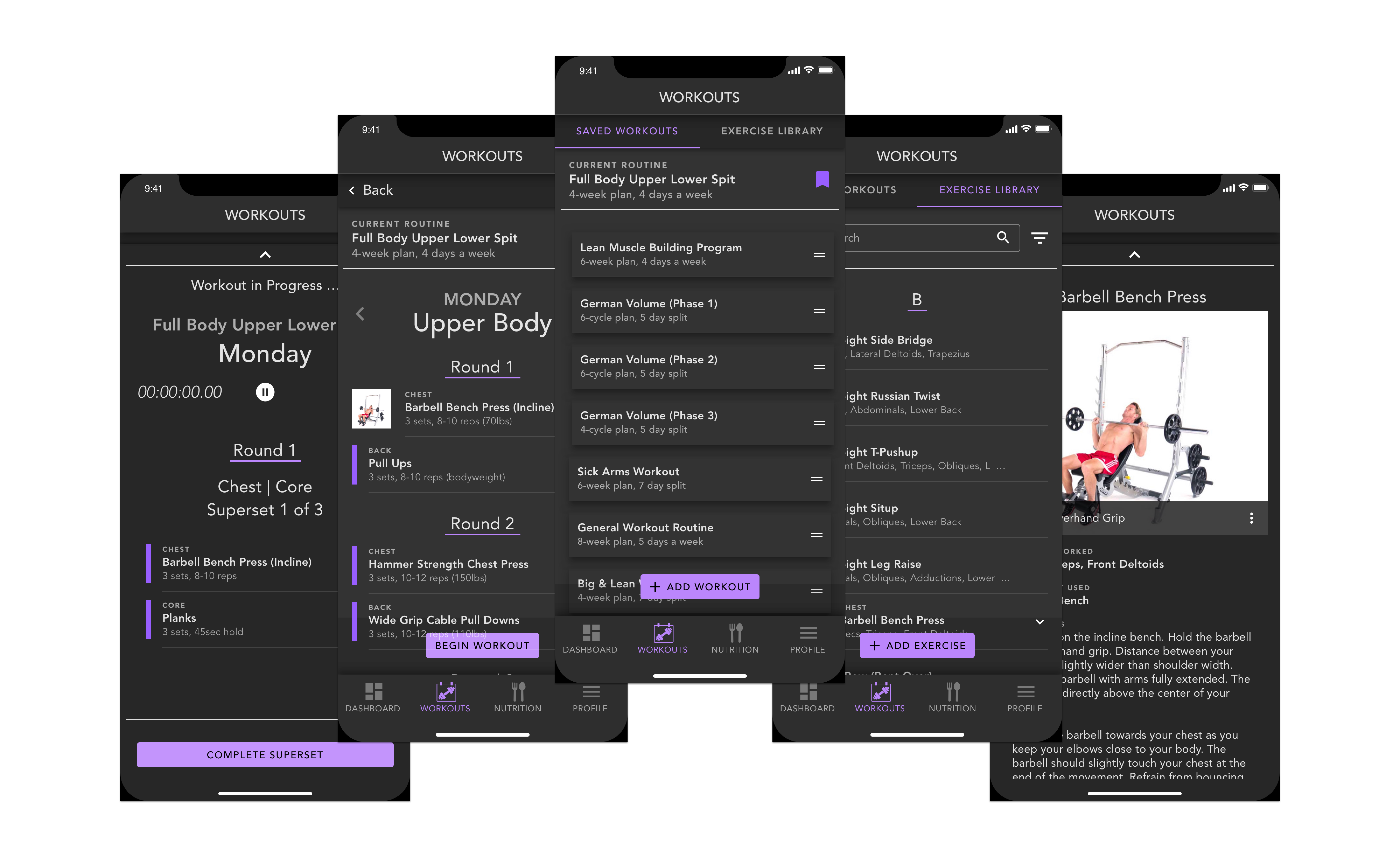
Saved Workouts
The idea of the ‘Saved Workout’ tab of the Workout feature is to give the user a place to view, conduct and/or create a catalogue of workout routines they can return to whenever they want.
Exercise Library
The ‘Exercise Library’ tab is a place where the user can view an extensive list of exercises. Each list item is categorized by muscle group, making it easier to search for a desired exercise. A details screen lets the user see more info on a selected exercise.
Working Out
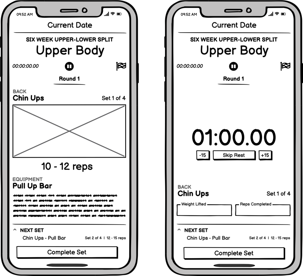
The actual ‘Workout’ feature lets the user execute their custom created workouts. The idea was to show a specific exercise by day, round, and set. After a user has completed a set (or exercise), they enter the timer screen, where they can input their progress, like rep count and weight lifted.
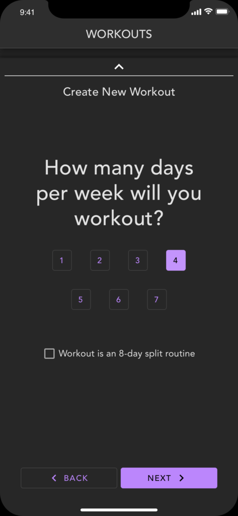
Creating a Workout
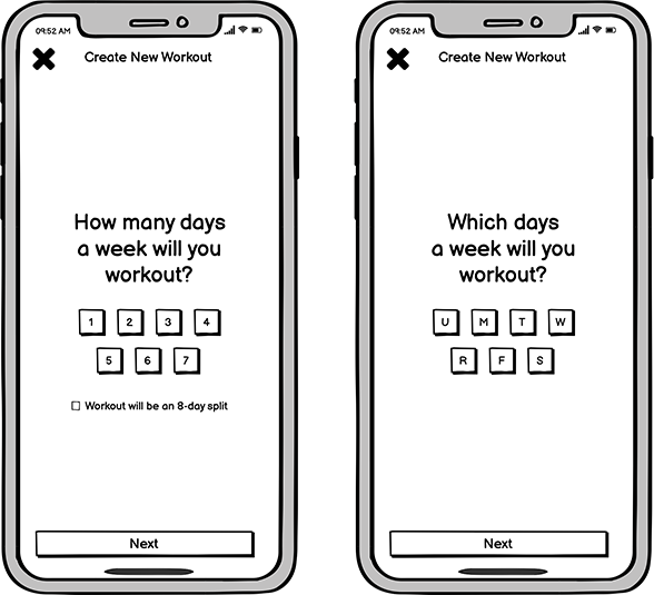
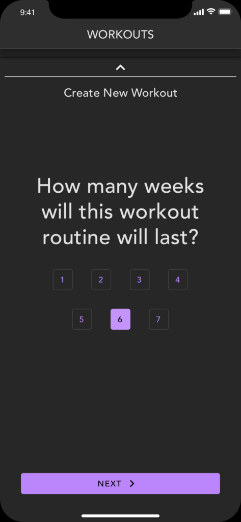
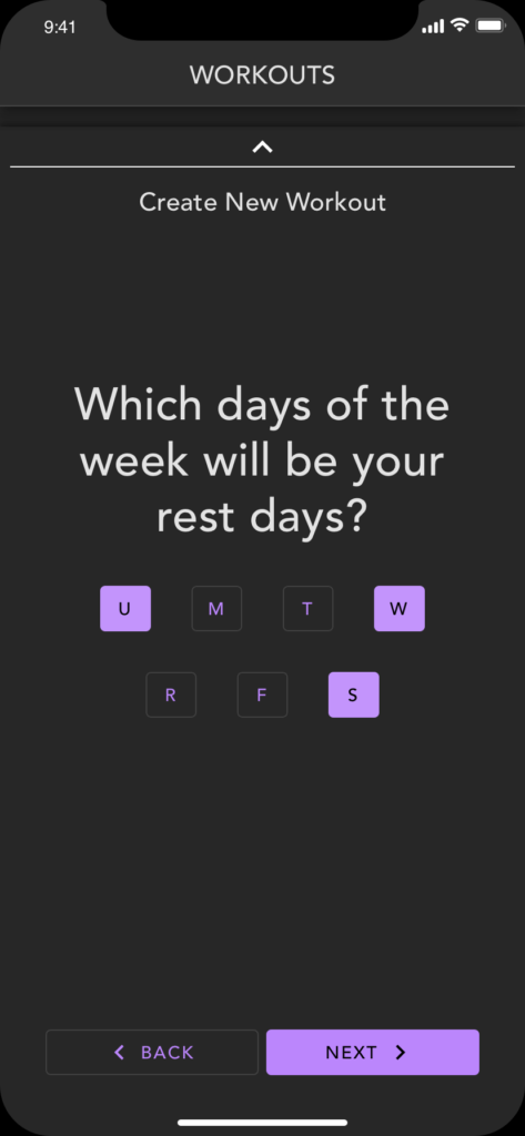
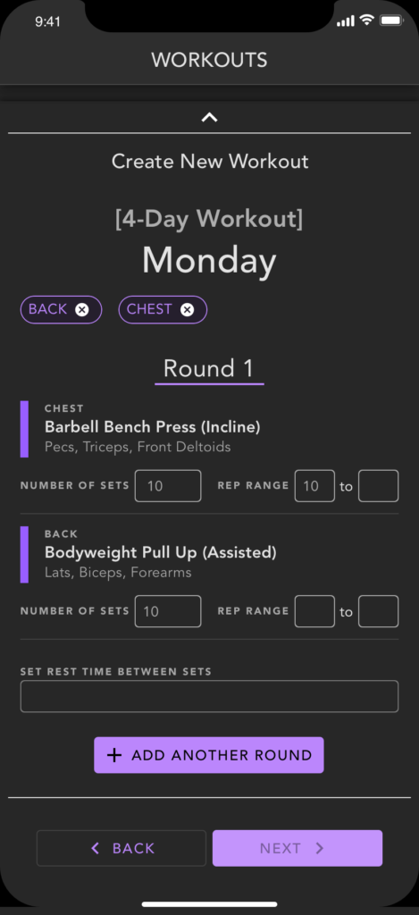
The user will first define how many weeks a routine would last before the app would recommend changing it up. From there, the user would select how many and which days they would workout each week.
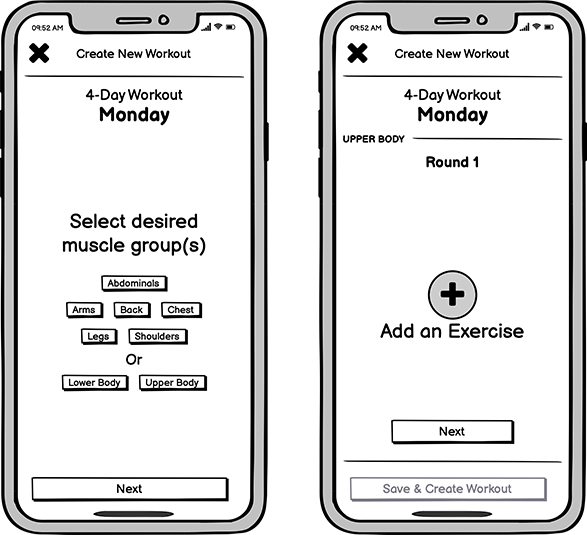
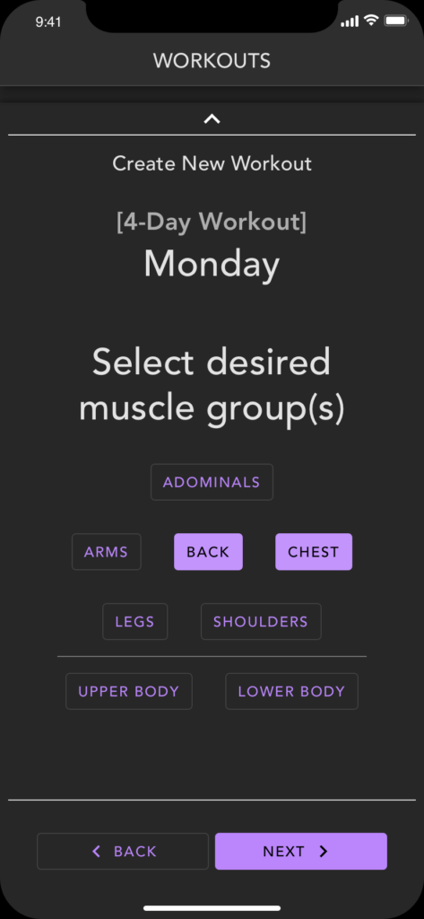
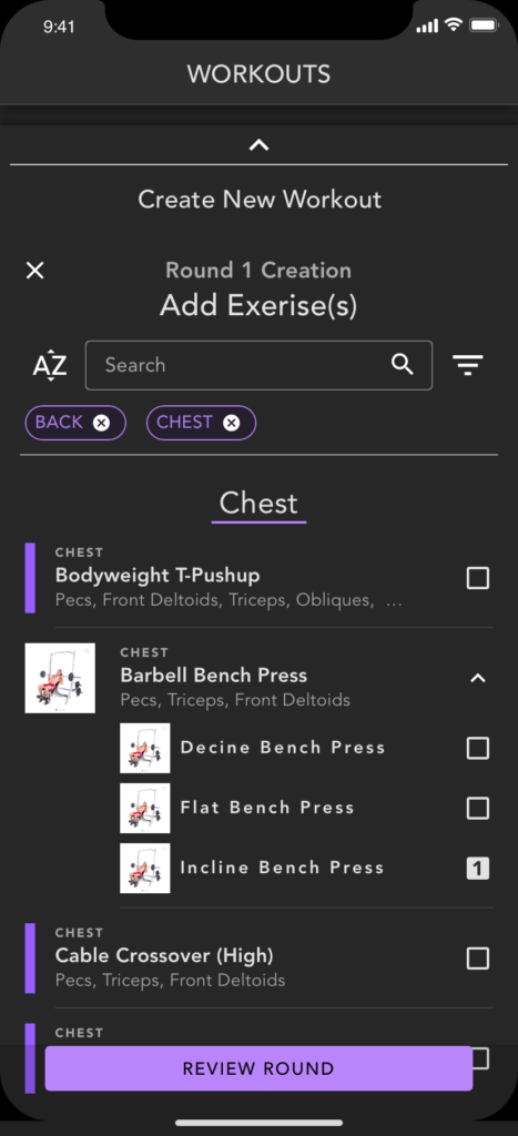
Next they will select which muscle group(s) they will focus on for a specific day. Ideally, by defining a muscle group, when they are ready to select an exercise, the list will already present filtered content.
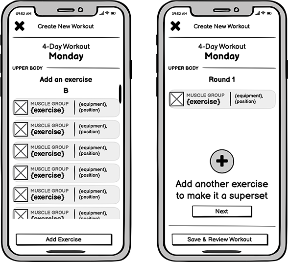
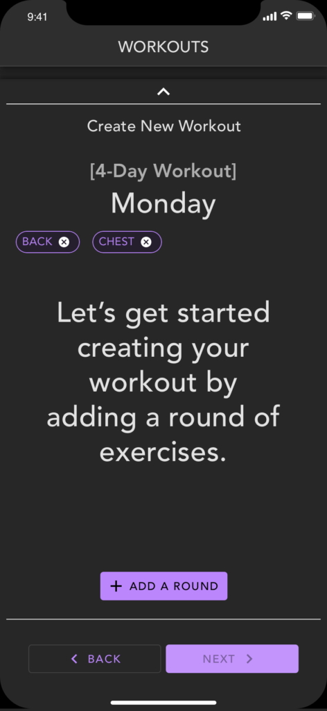
The user will see a list of exercises similar to what they’ll find in the exercise library section of the app. Here, they’ll select a single, or multiple, exercises. They can then opt to create another round of workouts, or move on to the next day.
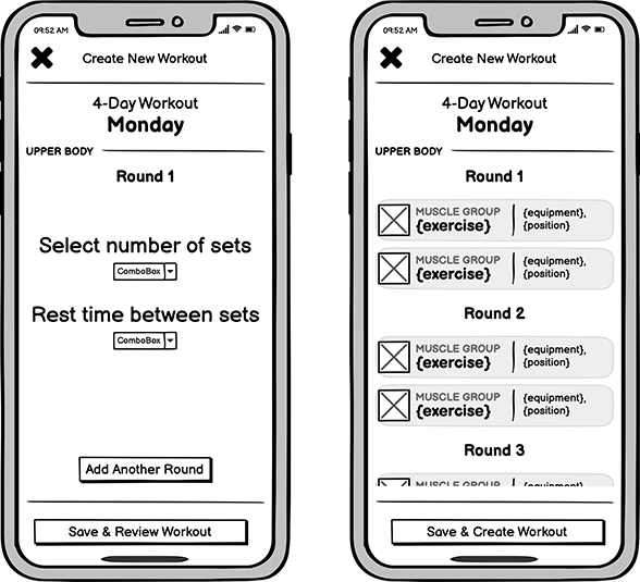
before moving on to another round or skipping to add exercises for the next day, the user will define the number of sets per round and the rep ranges. Various times throughout the creation flow, the user will be able to review what has been added. When the user is ready, they will review one final time, then save this new routine to the workout list.
Mid-Fidelity Mockups
When I felt like I had enough to move on and explore designs with a bit more polish, I started creating screens, and interactions in Sketch, using modified components from the Google Materials design library. Using these established component sets as a jumping off point, I saved several hours of work time, which allowed me to focus more on the nuances of how users interact with with the application.
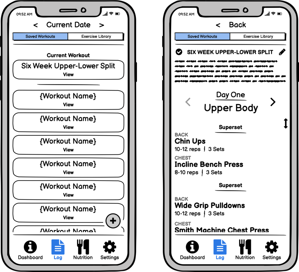
Saved Workouts
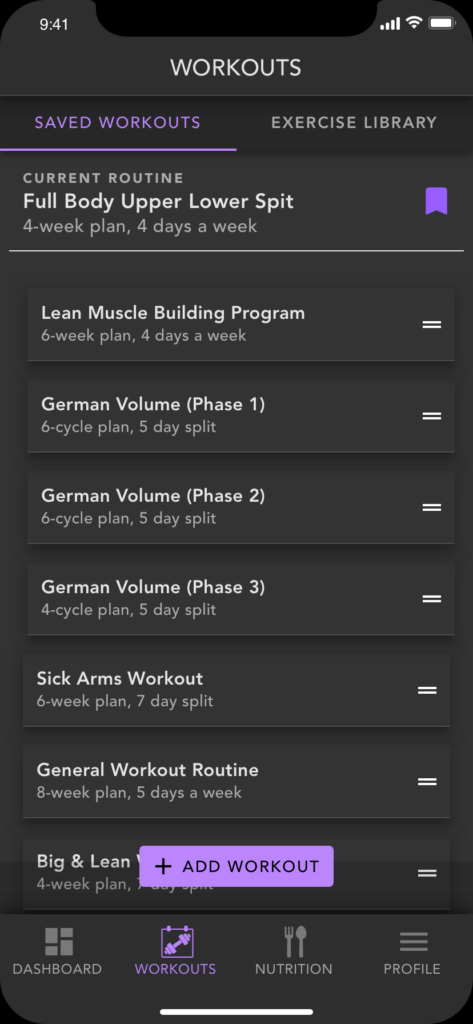
In this updated view, the current workout is tagged to the top of the screen to convey its higher priority. Each workout card presents the user with key information including the name or the routine, how long the user should use this routine before switching it out, and how many days the user needs to conduct this workout each week.
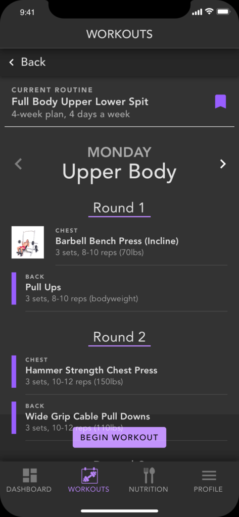
If the user selects a workout from the list, they will see a breakdown of the workout plan for each day of the week. From here the user can begin their workout.
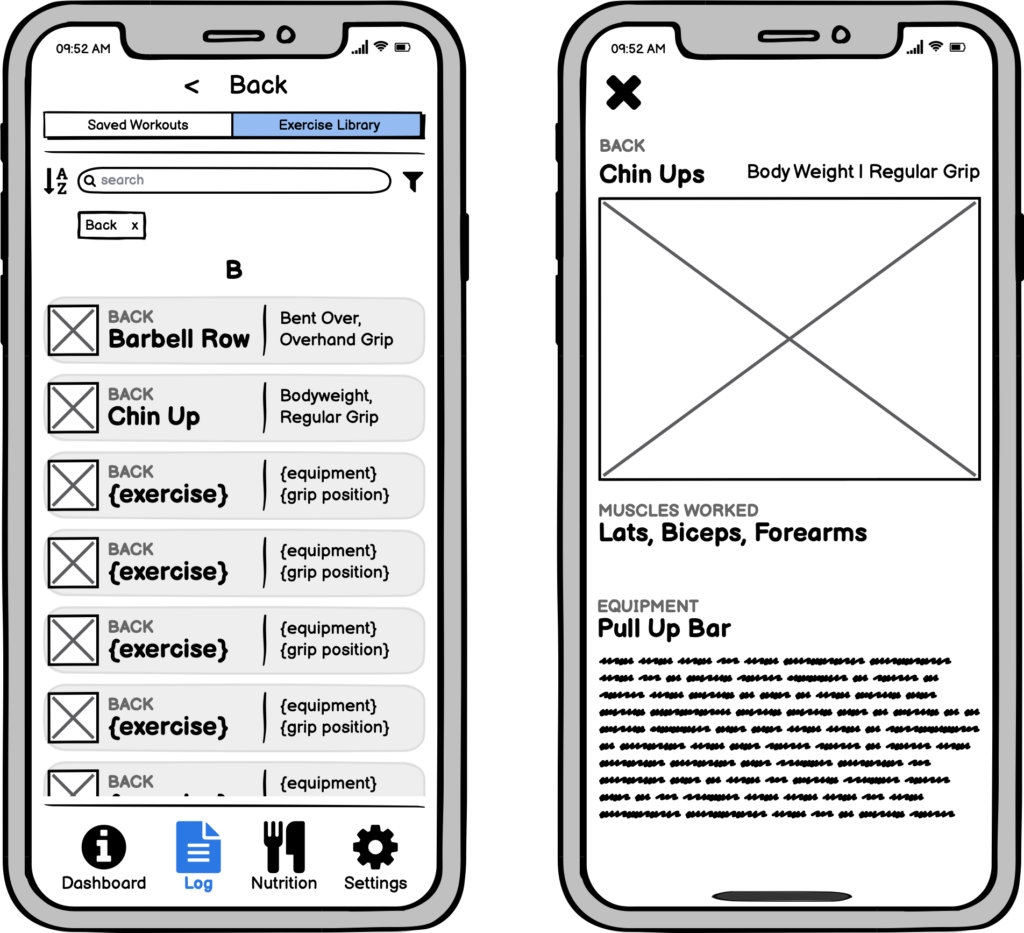
Exercise Library
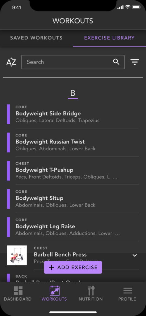
For the updated mockups of the ‘Exercise Library’, information is more clearly defined. The exercise list hints at the ability to search and filter content. Each exercise card is tagged with an over-line above the name of the exercise labeled with specific muscle group that the exercise is categorized under. Below the exercise name displays the specific muscles this exercise hits.
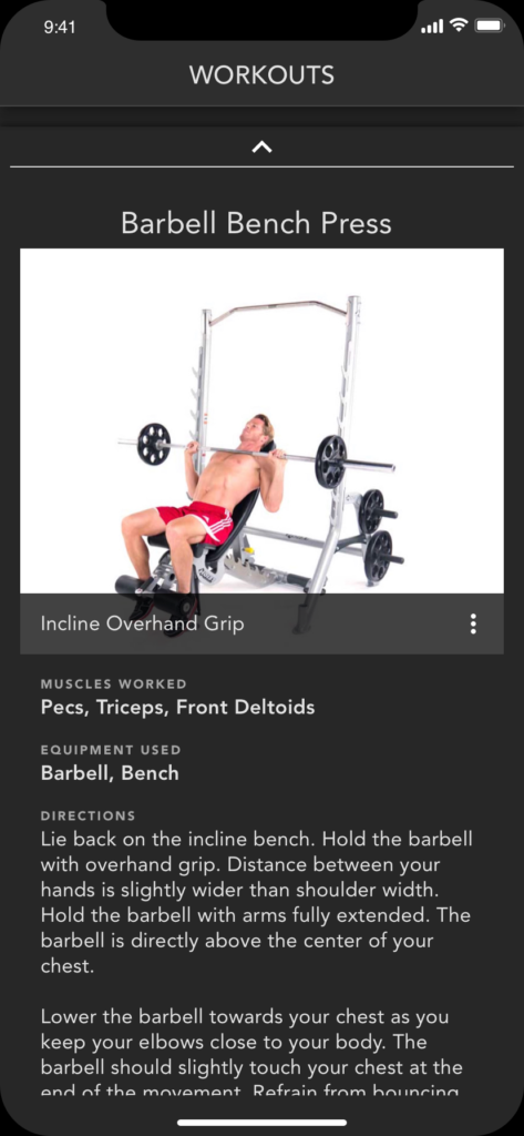
When the user clicks on the an exercise, the resulting info screen will display a gif or static image to help guide the user. Additionally, there is information about muscles worked, equipment needed, and directions for proper execution of the exercise.
Creating a Workout
I wanted to remove as much of the guess work as possible from the user’s journey. So I mapped out a flow that would take user through the creation process step-by-step. As I spent more time looking over the low fidelity wireframes, I started to notice some gaps in the flow that could be added to give the feature a bit more choices for the user to choose from. Upon viewing these mockups, it should be pretty self explanatory what to do.
The Prototype
All of my hard work into research and design, had lead to this … A prototype that takes the user through some task flows, including: navigating between the Saved Workouts and Exercise Library Screens, viewing workouts and exercises, and finally creating customized workout plan.
User Testing the Prototype
After I created and refined the prototype a few times, I enlisted a former interviewee to conduct a user test of the workout creation feature. During testing session, questions arose about how users add multiple exercises to a single workout round. There was also some clear pain points when it came to how and where a user edits their workout plan. I’m certain further testing will reveal more insights such as these.
This project really challenged my assumptions, specifically, that most people were frustrated with with apps that require subscription services. It would be interesting to see if that trend changes with a larger sample size of user feedback. Looking beyond the four documented apps I highlighted in my analysis, I noticed that a lot of apps are lacking a detailed workout creation feature.
Overall I think the findings from my research really helped me create, or begin to create an application that has the potential to be commercially viable, offering a better user experience, and some features that aren’t commonplace at the moment.
Challenges & Learnings
Of course this process wasn’t without challenges. Many times, I had to contend with some sudden work interferences. I also ran into a problem with attracting participants that weren’t really interested in talking about fitness apps, but just wanted the $25 gift card I was offering for participation.
I’ve since become aware of some online resources or communities of those invested in contributing to user interviews and testing. I think a good lesson learned here for me, is having contingency plans in place for when things get complicated. It’s never too early to start soliciting participants, even if you only have general idea of where you are planning to take your next project.
What’s Next?
I really enjoyed putting this project together and plan to continue working on it beyond any educational requirements. A priority will be more user testing of the workout feature. I’m really excited to get feedback from what I’ve built so far and how I can make it better.
Also, I plan to begin mapping out other features in the application, specifically, the nutrition feature. I suspect I will have to go back to the drawing board with this, conducting more interviews and analysis of other applications, as a majority of my research so far was focused on the workout feature.
Finally, as I only got to the mid fidelity phase of the design process, I will continue develop the style, and move away from Goggle’s Material Library as a basis of my flows (when it makes sense). Aspects of this design evolution will include dedicated color and font styles backed by accessibility standards, and more visuals for exercises and workouts, such as thumbnails, featured pics, and instructional videos.